Research With Colour Theory
Artworks

Monochromatic
This is a Pablo Picasso painting the reason it is a
Monochromatic piece is because of the excessive
use of one colour in different tones and shades there
is some brown in there but it is mainly shades and
tones of blue leaving a very miserable feeling to it you can see the man is depressed possibly busking defiantly a sense of loneliness.

This a self portrait on Van Gogh again it is a monochromatic piece with a very lonely feel with it it does have some complementary colours in it but it is more so monochromatic the rhythm flows through this piece beautifully leading your eye around the picture, the bit that stands out to me is his eyes they are very deep and meaningful and show a lot of feeling in this.
Cubism was one of the most influential visual art
styles of the early twentieth century.
It was created by Pablo Picasso (Spanish, 1881–1973) and Georges Braque (French, 1882–1963) in Paris
between 1907 and 1914.
The French art critic Louis Vauxcelles coined the term
Cubism after seeing the landscapes Braque had painted in 1908 at L'Estaque in
emulation of Cézanne.
Dada
Dada was born out of negative reaction to the horrors of World War I.
This international movement was begun by a group of artists and poets
associated with the Cabaret Voltaire in Zurich.
Dada rejected reason and logic, prizing nonsense, irrationality and
intuition.
The origin of the name Dada is unclear; some believe that it is a
nonsensical word.
Others maintain that it originates from the Romanian artists Tristan Tzara
and Marcel Janco's frequent use of the words da, da, meaning yes, yes in the
Romanian language. Another theory says that the name "Dada" came
during a meeting of the group when a paper knife stuck into a French-German
dictionary happened to point to 'dada', a French word for 'hobbyhorse'.
To me dada is the favorite son of Surrealism using
many similar techniques but still driving forward as a movement of its own the
movement is surrounded in history and many different famous names and is
renowned for being so vibrant, obscure and just Dada.
Pointillism
Pointillism
is an original form of art created by George Seurat and Paul Signac
developed the technique in 1886, branching from impressionism.
Pointillism
is a bunch of tiny dots formed together to make a picture.
Why
we use pointillism instead of using a paintbrush and just painting is because
pointillism is brighter and the other kinds of paintings can be dull.
When
two colors are next to each other, your eye mixes them and that is called
optical mixing.
Using
optical mixing instead of physically mixing can make a brighter picture.
Seurat’s
“A Sunday in the Park” took him two years to complete covers a wall (81 inches
by 120 inches) and has about 3,456,000 dots!
George Seurat
A Sunday in the Park

Pointillism
is an original form of art created by George Seurat and Paul Signac developed the technique in
1886, branching from impressionism.
Seurat’s
“A Sunday in the Park” took him two years to complete covers a wall (81 inches
by 120 inches) and has about 3,456,000 dots!
The
Colours
used in this a pale and calm, make the painting feel inviting as you would feel
on a clam Sunday nm the park, families are playing and walking dogs.
I’d
say the use of colour
in this piece seem to be of the Triadic colour scheme although the piece is not
that vibrant it uses a small range of colours
in the triangular pattern from the colour wheel.
Georges Braque “Fauve”
Georges Braque
was born on 13 May 1882, in Argenteuil, Val-d'oise. He grew up in Le Havre and
trained to be a house painter and decorator like his father and grandfather.
However, he also studied artistic painting during evenings at the École des
Beaux-Arts, in Le Havre, from about 1897 to 1899. In Paris, he apprenticed with
a decorator and was awarded his certificate in 1902. The next year, he attended
the Académie Humbert, also in Paris, and painted there until 1904.
His earliest
works were impressionistic, but after seeing the work exhibited by the artistic
group known as the "Fauves" in 1905, Braque took on a Fauvist style.
The Fauves, a group that included Henri Matisse and André Derain among others,
used brilliant colors to represent emotional response.
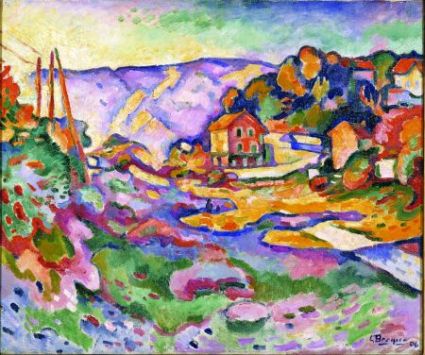
Fauves are always
very powerful pieces to me using strong contrasting colours and interesting
shapes and forms.
The colour scheme for this to me seems to be triadic
using Green, Purple and Orange mainly maybe a couple of blues and reds but
fauves and triadic come hand in hand, considering when using triadic the pieces
are very vibrant and stand out and this is what the fauve style is about.
The Piece here
looks like a meadow going into a village somewhere remote very peaceful with
depth of mountains and shrubbery in the foreground it is a part of the fauve
style as it makes you feel at peace and calm although it has vibrant colours,
they are set in a way that the eye flows around like the pathway in the center
is orange and blue and being complementary so your eye is drawn to that area
straight away and then the eye moves naturally around the work.
Otto Dix
He was a German artist, painter, print maker and water-colourist. His depictions of warfare and post-war Berlin shaped our impressions. Along with George Grosz, Dix was one of the more important figures in New Objectivity. While Grosz delved into the shadows of modern society, Dix stared into the abyss

Modern War: Dix was a veteran of the First World War. He was haunted by the brutality of warfare long after the war finished. Through his art, he returns to the derelict landscape of military trenches covered with mutilated bodies. The dead are distorted by decomposition. Human characteristics are unrecognizable in gas masks and steel helmets.

The Aftermath: His veterans are pitiful figures, disfigured by war and ignored by survivors. Those who profited live with abundance while the wounded rot in poverty. A blind veteran sells matches on the street as people ignore him, a uncomfortable reminder of humiliating defeat. Just one living thing acknowledges the veteran. It is a dog who urinates on his stumps that were once his legs.
The colour in his works vary in his earlier stuff it seems to be warm pallet dark a twisted and in his later stuff it’s a cooler pallet, the obvious meaning to the first picture is a derelict waste land and the second is a blind busker but in both a slightly hidden meaning is the personal feelings he has in both the fact that the war has effecting him emotionally and he can see what it has done to others and it shows in his works, there all very deranged and physically manipulated the first one does make me feel empowered against war and the second makes me feel sick for those who are injured veterans and have no help or family they’re both very relatable even if you haven’t been in war or known anybody in one it still makes you feel sympathy for the veterans and war victims.
Pablo Picasso

portrait of Suzanne Bloch is a painting by the Spanish artist Pablo
Picasso, executed
in Paris in 1904, towards the end of his blue
period.
This piece is easily recognizable as a
monochromatic the colour used here is blue although in different shades, tints
and tones it is very blue! It’s just a portrait at first glance and
maybe second glance I’m not sure if there is any abstract meaning behind this
but it is beautifully painted the strokes are all very individual and
interesting. To me it seems like a
miserable painting, its blue and calm and even the subject seems miserable
its beautifully crafted but misrible.
Tristan Tzara “Dada”
Tristan Tzara (whose birth name is Samuel Rosenstock
was a Romanian and French poet, essayist and performance artist. Also
active as a journalist, playwright, literary and art critic, composer and film
director, he was known best for being one of the founders and central figures
of the anti-establishment Dada movement.
“The
beginnings of Dada were not the beginnings of an art, but of a disgust” Tristan
Tzara, From "Dada Manifesto" 1918
This piece has man sat at the front,
disfigured as are many figures in this with a building in the background and
some household objects with mannequins, but looking deeper into this picture it
makes me think of religion and sex. The reasons for this are varied and I will
list them.

1.
At the far back there is a body that looks as if
it has been crucified.
2.
The figures in the foreground look as if they
are praying and asking or forgiveness
3.
The objects on top of the building look like
rockets and penis’
4.
The building has windows similar to churches
5.
The light to the right in the sky is a lot
brighter than the rest of the sky, divine intervention
This piece is disturbing to me and I think that’s what they
would have wanted, we are all wired to have some sort of feeling towards
religion and sex so to use them both in one image will invoke reaction in the
viewer. The colours used in this I think
are very important they are complementary, this piece use’s Yellow and Blue, on
the colour wheel it would be Orange and Blue but Yellow works too. To me it
works well and achieve what it wants and when it was done I can imagine it
caused a wide range of emotions and responses which is what Dada is about.
Willem
de Kooning
(April 24, 1904 – March 19, 1997) was a Dutch
American abstract expressionist artist who was born in Rotterdam.
In the post
World war 2 era, de Kooning painted in a style that came to be referred to as
abstract expressionist or Action painting, and was part of a group of artists
that came to be known as the New York School.
In September 2011 de
Kooning's work was honored with a large-scale retrospective exhibition:
de Kooning: A
Retrospective
September 18 2011 –
January 9 2012 at MoMA in New York City.
Organized by John
Elderfield it was the first major museum exhibition devoted to the full extent
and depth of de Kooning's career, containing nearly 200 works.

The colour theory of this picture is to me Monochromatic or analogous. the reason i say monochromatic is because it is different shades, tints and tones of green or yellow and the reason i say its analogous is because its green, yellow and light orange which are all next to eachother on the colour wheel.
its a picture of a person abstracted and blured into the background its pretty simple and expresionate.
Urban

Urban

This is a stop sign! it is a octogan ith a red fill and white writting reading stop.
The reason for this is red is a hard colour representing danger so when seen you are more likley to take notice it and the word stop is in capitals. the colour red is a wark coulour with alot of emotional feelings attatched but for signs it is used for danger.
 Here is a wall with graffiti on it. its a picture of a owl regurgitating plants and leafs.
the meaning for this could be the animals want there habbitat back and to take away the constructed world, the other thing is it could be just for looks. The colour scheme here is analogous using colours all next to each othe ron the cheel, but on the owl his eyes are orange and the owl itself is blue this is complementry so using a range of schemes can still work.


the meaning of this is to say in this direction there is a café a toilet and a disabled toilet or disabled acsess to the café.
the colour scheme is simple here whte symbols it could be classed as monochromatic as it is just on colour tint it can be used on any background and is always noticable and white is a bright tint and goes with anything.

This is another piece of graffiti and perhaps more well know done by our own bansky. not sure myself what it means but its a paint bucket on a angel so maybe just the fact that it is unauthadox is what he wanted to achive here. is simple one colour pink paint on a grey statue, giving the sceme of maybe warm, new and vibrant colour on a cool old background.

STREET SIGN!
arrow to the knee......
This is a round sign filled with blue and whit arrow in it.
the round shape is a flowing shape no sharpe edges or points to show soft and calm the colour is a calm and cool colour (blue by the way) showing there is no urgency and time to react with a white arrow again white can go on anything and is used as the direction given symbol.

Here is a yellow box wigth GRIT written on it. the box is yellow and in most cases dirty. yellow is a warm colour and stands out in most urban atmospheres so it can be found when snowy and icey it has been there for years and is a part of urban society uniteresting in design but important.